3 things to consider before you sew
Every one who sews, designs.
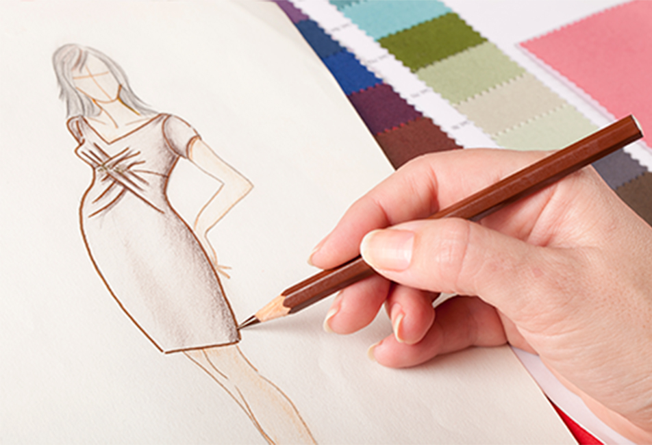
Each time you sew a pattern and choose the fabric, you are making a design choice. And if you move on and add details on your own (like pockets, new necklines, collars etc), those are design choices as well.
I think you choose your design details from what you think will look nice, or what you would like to sew. And I think, that sometimes it doesn’t work as well in reality, as it did in your mind.
But do you know that there are rules you can follow and theories that can help you figuring out if the clothes will look good on you before you begin your project? Yes, you can figure it out in the planning phase – long before you have spend time and fabric on a garment you don’t like to wear!
What are design choices?
Design choices are choices you make to control the eye, so that it sees the proportions and focus on the points, we want it to. And sometimes we make choices to trick the eye.
And yes, it is possible to both trick and steer the eye.
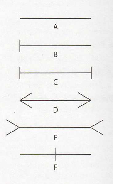
Look at the lines below. They are all the same length. But because the eye is being tricked by the ends of the lines, they don’t seem to be be equally long.
In this article, I’ll show you 3 design considerations you can make when you sew – and give you some advise on what to choose:
Consideration #1 to make before you sew:
What do you want to emphasize or downplay on your body?
I think we all have some part of our body that we like and another area that we aren’t that crazy about. I know I do: I kind of like my legs and my butt, while I’m not that pleased with my tummy and my waist area.
So For me to feel good, I need to draw attention away from the tummy area. If my tummy is obvious, I feel uncomfortable.
Instead I dress to emphasize my legs by wearing short skirts, or long skirts with high vents and use nice stockings and fab heels.
The important rules for this are:
Rule #1: Only emphazise what you like people to see (because people will notice!)
- Ex1: Emphasize skin, face and collarbones with collars, lapels and necklines
- Ex2: Emphasize the bust with deep necklines or close fitting jersey
- Ex3: Emphasize your legs with short skirts, nice hosiery and shoes, with close fitting pants /jeans and with vents in long skirts
- Ex4: Emphasize the waist by having seams (maybe further emphasized with piping) at the waist or with belts and trim.
- Ex5: Emphasize your butt with close fitting pants, pencil skirts or jeans
Rule #2: Only emphasize one part at the time (because otherwise it will have the opposite effect!)
If you emphasize too many things, by having too many design details or too many focus areas, the effect will be quite the opposite: The eye gets confused and draws away from the details and towards ares you might want to hide
A classic example would be if you both emphasize the bust and the legs: A short tight skirt and a very low cut top, at the same time.
For some reason, the look might easily seem “too much” – too confusing – too loud. And instead of seeing the person who wears the outfit, you only notice the clothes (or the lack hereoff..)
In the same way, a lot of my students, who are into wearing retro-styled jersey dresses, feel the need to add many, many details to their dresses. Elaborate collars. Contrasting cuffs. Pockets with piping. Contrasting colours. Waist belt.
And while each of these details on its own could look great and work well in accentuating the personality and the body of the person who wears the dress, the combination of too many details will be a mess and too much.
If they instead only highlight for instance the face and the collarbone with an interesting collar (maybe made in a contrasting colour) and perhaps add a matching cuff, the details will work to accentuate the playful personality, with the fabric choice and the details.
Consideration #2 to make before you sew:
How are you going to use design lines to highlight or downplay areas of your body?
We work with two types of design lines: Outer design lines and Inner design lines.
The outer design lines create the silhouette of the garment. It could be the A of an A-line dress or the shaped waist. Which shape that works best for you, depends on, among other things, your body type, which I’ll get back to in a later blog post (and also there is already plenty of articles on that… :-))
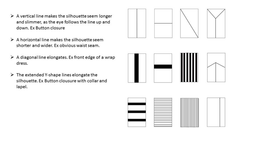
The inner design lines are lines inside the silhouette, that works to trick and direct the eye. Usually we rather want to trick the eye into seeing us taller and slimmer than shorter and wider.
The inner design lines can be obvious seam lines, the slanted front edge on a wrap dress, button closures and stripes int he fabric.
The slide below shows that there is a good reason to think about the lines and the thickness of stripes.
One of the reasons why wrap dresses looks great on most women is the diagonal line of the front edge: It guides the eye onto a longer journey, so to speak, and make the outer design lines seem narrower and longer. And it doesn’t hurt either, that the cut emphasizes the bust, while the tummy is camouflaged by the folds of the fabric.
Consideration #3 to make before you sew:
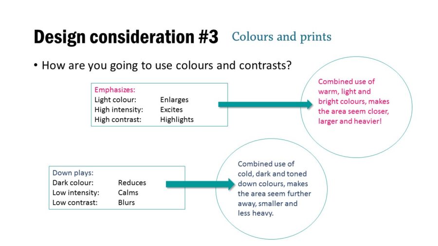
How are going to use colours and contrasts to emphasize or downplay areas of your body?
When you choose the fabric for your garment, it’s worthwhile to consider colour and contrasts when you are planning your project.
Contrasting colours highlights and so do high intensity colours (like primary and neon).
The eye wanders towards light colours and the lighter colours might also make an area appear larger. So if you want to put emphasis on an area, you can use these tools.
But be careful not to exaggerate: A combined use of light, bright colours will also make an area seem closer, larger and heavier.
That does not mean that you can’t use colourful fabrics without seeming larger than you are. But avoid contrasting colours – like large scale patterns with colours that are far from eachother in strenght and tone. And consider downplaying other details, which can confuse the overall impression.
On the other end of the spectrum we have the dark, low intensity and low contrasting colours. When you choose these tools the area will seem further away, smaller and lighter. That’s one of the reasons why we think black makes us look thinner.
Now you know a bit about some tools you can use to make your next project work better for you. We are of course only scratching the surface here…

I always love your posts Maria – if I lived in Denmark I would be at all your classes. I love the pattern I bought from you – the Annika dress. I’m always hopeful you will offer more of your patterns in print format. I’ve had trouble buying PDF from Europe – the scale is almost never right so I’m hesitant but when you do offer them in print let me know!
Thanks Maria, this is a great article. A lot of food for thought before I begin my next project.
Thanks. I always enjoy your posts.
Hi Maria
As alwaus some great advice. But ask how I can draw the eye away from my top half as I use a wheelchair full time. My top half is the first thing people see as I use a manual wheelchair so I am propelling moving towards them!Any thoughts?
Keep your ideas coming always informative and inspirational